Aviso
This article is a transcription of my talk "Redimensionando Apps de iOS". You can watch the full talk (in Portuguese) on YouTube.
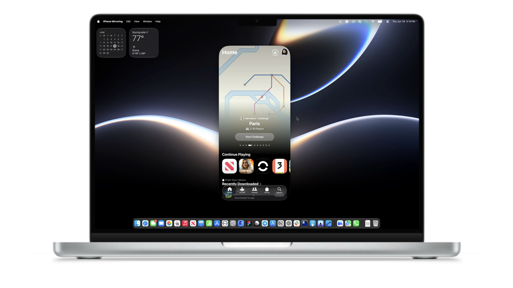
Resizing iOS Apps
Article originally written in brazilian portuguese. Translated by: Claude
There are many reasons why we love using and developing for Apple devices. Meticulously designed hardware, built with the highest quality materials, software conceived solely to complement every aspect of that experience, thought through down to the last detail. And these devices talk to each other so easily and invisibly that it almost feels like magic. At WWDC26, an announcement that may have gone unnoticed by many is something that came to change the lives of almost all of us who develop for iOS.
iOS apps built with Xcode 27 can be resized in any direction, for use in iPhone Mirroring and on iPadOS. In practice, this means that every iPhone app is now also an iPad app.
And there is no way to opt your app out of this new behavior. Believe me, I tried. UIRequiresFullscreen, windowScene.sizeRestrictions, .frame in SwiftUI. Nothing works. You can configure a minimum size, but not a maximum one.
The truth is this isn't a new topic
During the "What's new in Cocoa Touch" session at WWDC14, Apple introduced the theme of Adaptivity in iOS 8. In the beginning, there was the iPhone, and then Steve Jobs said "let there be iPad". Since then, people began clamoring for more apps on such a big screen, and a multitasking mode appeared on the iPad, with new, fixed, and very specific app sizes. Long story short, all of that changed with the arrival of iPadOS 16 and Stage Manager, where apps became windows the user can arrange however they want. And now all of this changes once again.
So how does the process of transforming your app begin? With familiarity.
Familiarity
By adopting Liquid Glass and the system APIs, your app gets the interface and navigation behaviors the way iPhone users expect, and you don't have to worry about spending time adapting anything. It's not directly related to the topic, but worth remembering: starting with iOS 27, adopting Liquid Glass also becomes mandatory.
That said, there are still some platform differences that designers will have to pay attention to when creating layouts that adapt across devices. The same app built with Xcode 27 presents two different interfaces: on iPad, the Tab Bar sits at the top, and in iPhone Mirroring, the tab bar sits at the bottom. It's also possible to adopt sidebar styles with the Tab, using the Sidebar's preferredPlacement API, as we can see in the Home app.
Your user lives on one platform at a time. The design parity between systems that you build at such great cost, they don't even notice. What they do notice is when the app behaves differently from every other app on their system. Brand identity doesn't live in the controls: it lives in the color, the typography, the tone, in what your app does. You can be recognizable without reinventing buttons and tab bars. I highly recommend the session "Communicate your brand identity on iOS" to understand how important adopting platform conventions is and how to communicate that.
APIs
Now let's dive into the APIs we can use to adapt our apps to multiple sizes.
UIApplicationDelegate
When building your app with Xcode 27, the first API you'll have to change, without even looking at a single screen of your app, is UIApplicationDelegate. In UIKit, you can replace it with UISceneDelegate or with the SwiftUI App lifecycle. Apps that still use UIApplicationDelegate won't even launch when built with Xcode 27.
The good news is that these APIs aren't new: UISceneDelegate was introduced in 2019 and is available starting with iOS 13, and the SwiftUI App lifecycle was introduced the following year, in 2020, available starting with iOS 14.
Size Classes
Let's now talk about how we can update our layouts, starting with the basics: Size Classes.
Size classes are basic definitions of the size available to your app, defined for the horizontal and vertical axes, split between the compact and regular sizes.
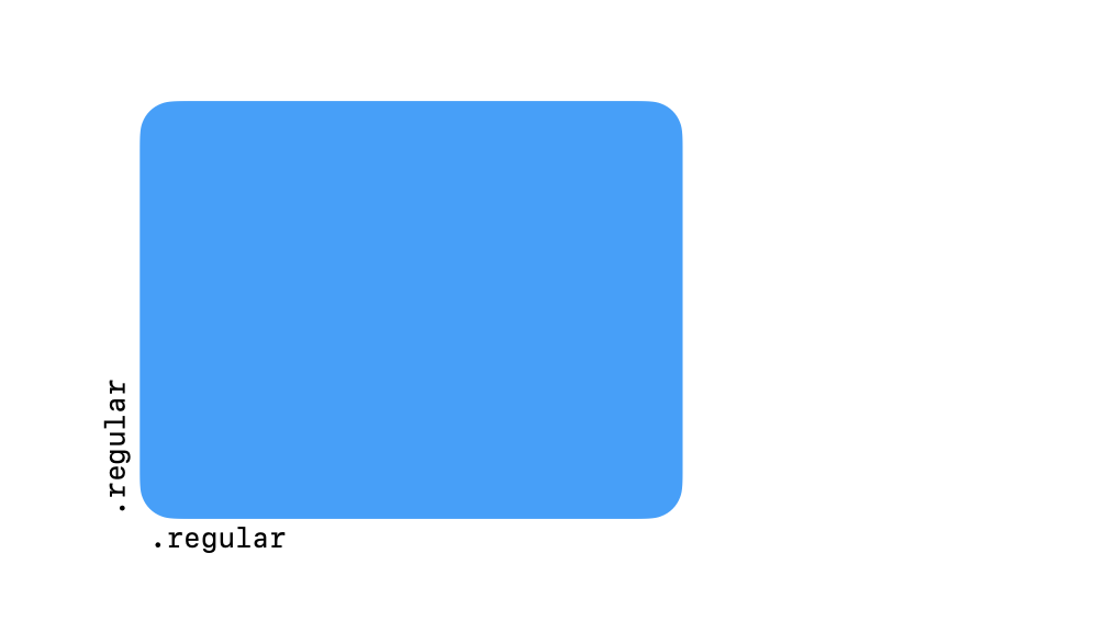
The two dimensions and the two possible size class sizes
Remember that iPad multitasking image? Apps in split screen have always been divided by size classes, and iPad app developers simply adapted based on that. Back then there was no vertical compact, because that mode was exclusive to iPhones, but today you can shrink the window height quite a bit too.
In SwiftUI, you can access these properties through the environment, and in UIKit the best way to react to these changes is by adopting the traitCollectionDidChange method up to iOS 17, and starting with iOS 17, registerForTraitChanges.
@Environment(\.horizontalSizeClass) var horizontalSizeClass
@Environment(\.verticalSizeClass) var verticalSizeClass
ViewThatFits
You can also work more surgically with ViewThatFits. It's a SwiftUI View that lets you provide all the interface permutations you deem necessary for a given element, and it will pick whichever one best fits the UI size the user has.
In the example below, we have a series of buttons with their actions spelled out. As my interface shrinks, SwiftUI draws on screen the largest version that fits the available space: first we lose the text and keep only the icons, and finally, when we no longer have room for any buttons, we turn our actions into a context menu.
swift
struct AdaptiveActionBar: View {
    var body: some View {
        ViewThatFits(in: .horizontal) {
            HStack(spacing: 16) {
                ActionButton(icon: "square.and.arrow.up", label: "Share")
                ActionButton(icon: "heart", label: "Favorite")
                ActionButton(icon: "bookmark", label: "Save")
                ActionButton(icon: "trash", label: "Delete")
            }
            HStack(spacing: 20) {
                ActionButton(icon: "square.and.arrow.up", label: nil)
                ActionButton(icon: "heart", label: nil)
                ActionButton(icon: "bookmark", label: nil)
                ActionButton(icon: "trash", label: nil)
            }
            Menu {
                Button("Share", systemImage: "square.and.arrow.up") {}
                Button("Favorite", systemImage: "heart") {}
                Button("Save", systemImage: "bookmark") {}
                Button("Delete", systemImage: "trash") {}
            } label: {
                Image(systemName: "ellipsis.circle")
            }
        }
        .padding()
    }
}
The example above, live: as the space shrinks, ViewThatFits falls back from labels to icons to a menu
Be careful, because the order of the Views matters here. ViewThatFits looks for the first view that fits the available space. If the order is reversed, putting the compact menu first, the others will never be shown on screen, because the first one always fits.
Breakpoints
For more granularity than Size Classes and ViewThatFits provide, we can go a level deeper and create our own breakpoints, defining specific screen sizes where we want the change to happen. Apps like Weather use more than just the two size classes to resize themselves, presenting multiple possible layouts for different interface space configurations, taking advantage of the available space in different ways rather than being a simple reflow of blocks.
Custom breakpoints in action: each layout takes advantage of the available space differently, instead of being a simple reflow of blocks
In SwiftUI, the onGeometryChange modifier, the GeometryReader View, or UIKit's layoutSubviews are your friends. Don't use UIScreen.main and APIs that relate directly to the device's screen for this kind of operation, because the screen your app is running on isn't necessarily the main one anymore, and you'll get values inconsistent with what you expect.
UIRequiresFullscreen
Anyone who has developed for iPadOS probably knows the UIRequiresFullscreen plist key. This key was used to remove your app from multitasking mode and force it to take over the entire screen. Widely used in games, but many apps use it too. It was deprecated at last year's WWDC, and starting this year its behavior changes once again.
When UIRequiresFullscreen is enabled, the app will still resize, but discretely, in jumps, instead of resizing fluidly. Games like AmarganA can adopt the key to get discrete resizing, where the app can still be resized, but the layout update only applies once the user finishes the gesture.
Try it: turn the key on and the new size only applies when you let go of the handle
UIUserInterfaceIdiom and UIInterfaceOrientation
UIUserInterfaceIdiom still exists and can be used to differentiate between an interface being displayed on iOS and on tvOS, for example, but the recommendation is not to use it to differentiate between devices with larger and smaller screens. The same guidance applies to UIInterfaceOrientation.
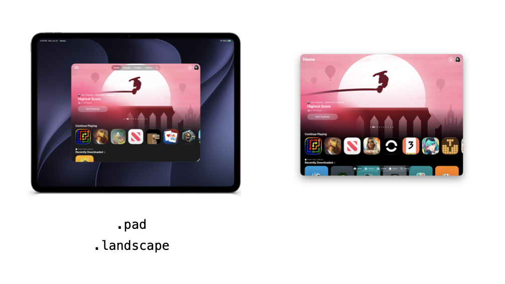
The same interface, at the same size, with completely different traits
In Apple Games, the same interface, at the same size, displayed the same way, has completely different traits in the two cases. On iPadOS, the idiom is .pad and the orientation is .landscape. In iPhone Mirroring, the idiom is .phone and the orientation remains .portrait, even though the window is wider than it is tall. iPhone apps running on iPadOS still report the .phone idiom. The iPad mini is also roughly the same size as the largest possible interface in iPhone Mirroring, so there's no need to create different interfaces for the different device types.
In practice
Let's see in practice how you can look at your app and apply all these changes. Joguei is an app I created with a friend to solve a problem we both had: we buy more games than we have time to play, eventually we forget all the games we've already bought, and we buy more, without having played the ones we bought before.
The home screen, which is where I invested 99% of my development time in this app, is a grid based on item size, so it shrinks and expands according to the available space without much effort on my part.
One of the coolest features of cataloging this data is being able to look at it later, so we created a statistics screen. You can even generate your monthly report, like an Apple Music Replay for your games. Let's see how its design adapts across different sizes.
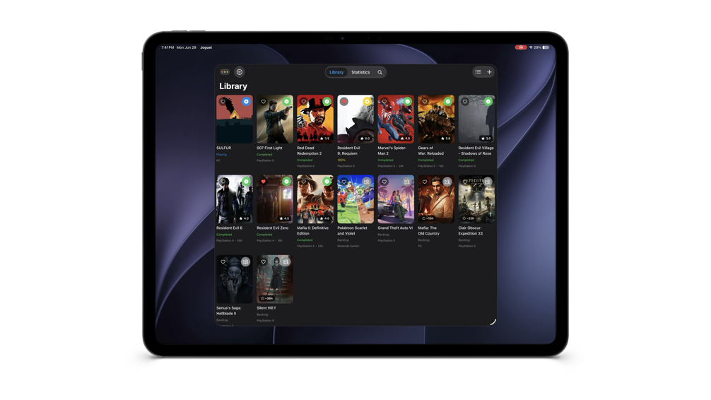
The list view works well on iPhone, but gets comically stretched on larger screens
The list view works fine for iPhone screen sizes, but gets comically stretched on larger screens. We have a usability problem here and we'll need to adapt our layout.
So, after talking to my real friend and my imaginary friend, this was the prototype of the new design we chose for the screen, and to adapt it we used size classes. I really like using Claude Design as a prototyping tool, to get a starting point and then work on the app's final design.
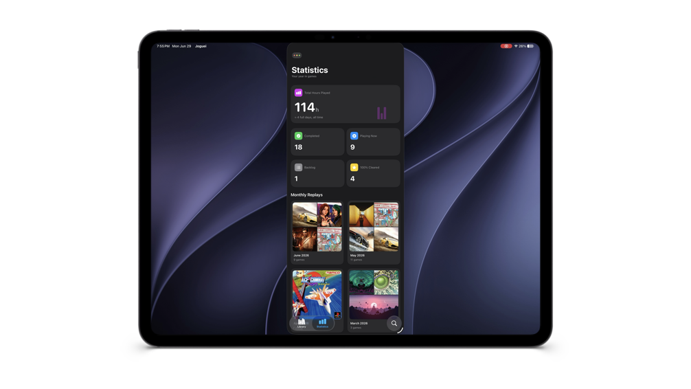
The final result: there's still room for improvement, but it's already much better adapted to the reality of resizing
Finally, let's look at the screen where we register our games. It's a sheet that can be invoked from anywhere in the app. On iPhone, this sheet works well. On larger screens, I think we can make a bit more use of the space, and once again size classes do the job of telling us when the layout needs to change.
Deadlines
Now let's talk about deadlines, starting with Xcode.
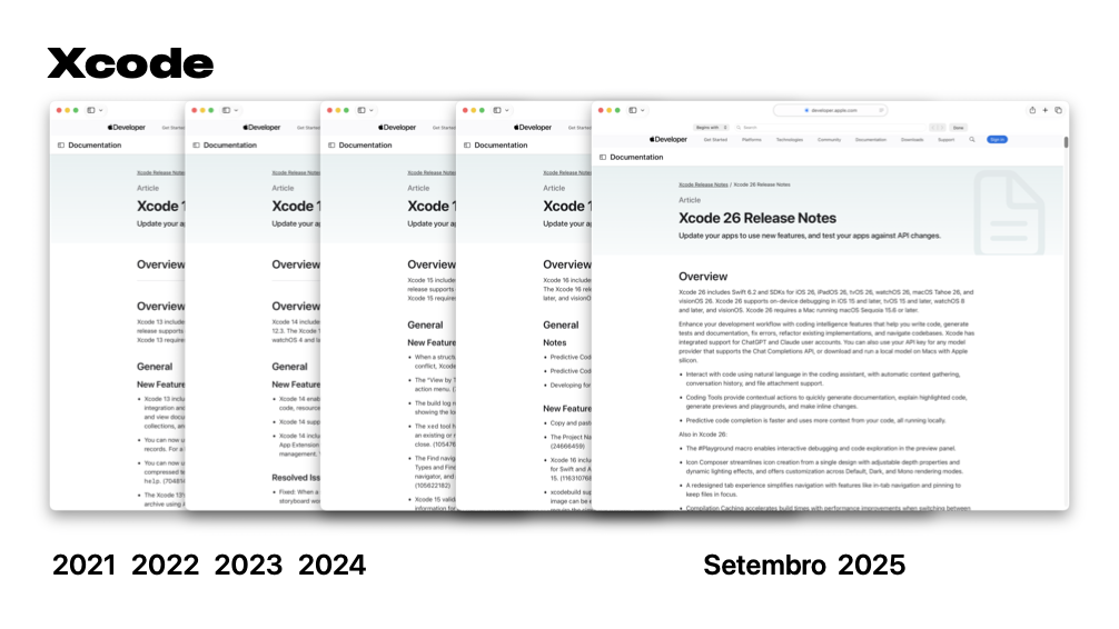
Historically, a new version of Xcode and iOS arrives every September
In September 2021, Apple released Xcode 13 and iOS 15. In 2022, Xcode 14 and iOS 16. In 2023, Xcode 15 and iOS 17. In 2024, Xcode 16 and iOS 18. And in September 2025, Xcode 26 and iOS 26. Historically, the new versions of Xcode and iOS are released in September, and we have no indication to believe this year will be any different.
That gives us... 2 months to validate all of this. Well, 12 years and 2 months, right?
And the update date for the minimum SDK versions for App Store uploads, when we'll be forced to use the new version, also follows a historical pattern, except this time in April. So we have quite a bit more time: 9 months. You can make a whole new child in that time, and you're going to tell me you can't update your app?
In summary, what's your homework?
Let's break it into steps. First, you'll download Xcode 27 and migrate your app to the modern lifecycles (UISceneDelegate or SwiftUI.App). Then, you start investigating which screens and flows matter most and where you can spend your effort to redesign them in the best way. If you want to adopt the new features right when iOS 27 is likely released, you have 2 months to do it.
In Xcode 27, with the new Device Hub, there's a new button at the top of the window that you can use to enable resizing mode, perfect for testing whether your app can work in multiple different layout modes. With SwiftUI it's easy to adapt our interfaces to different sizes and improve their usability.
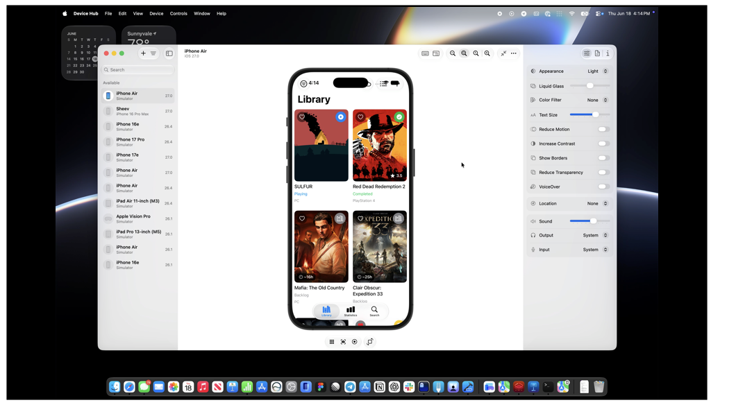
The resizing button in Xcode 27's Device Hub
Can't migrate to Xcode 27 yet? No problem. Add an iPadOS target to your app using Xcode 26 to discover which changes are needed and test the resizing APIs. You have roughly 9 months to switch SDKs, but you can already ship every change you make to the App Store right now. Apps like Ivory adapt their design from smaller screens to larger ones with simpler solutions, instead of rethinking the entire flow. You don't need to revolutionize your entire app's design all at once.
And like everything nowadays, Xcode 27 ships with built-in modernization skills to make the migration easier with your agents. You can even export them to use in any harness, without needing to invoke them directly from inside Xcode:
xcrun agent skills exportWelcome to the rest of the industry
The truth is we're now catching up with the rest of the industry. Developers who write apps for Safari have been writing apps that are required to work on multiple screen sizes for decades. Not to mention the green platform: who here has ever had to build a T layout?
Thousands of apps on the App Store are already ready for this change. When will yours be part of it?